
There are hundreds, if not thousands, of built-in metrics available for services in Google Cloud. These are collected automatically and can be viewed in the Google Cloud console. For example, you can view the metrics for a Cloud Run service by selecting the service and then selecting the Metrics tab. All these metrics are also available programmatically.
Google Cloud offers a vast array of built-in metrics across its myriad of services, with the numbers potentially reaching into the thousands. These metrics are seamlessly and automatically gathered, allowing users to gain insights into various aspects of their cloud infrastructure and applications.
To access these metrics via the Google Cloud console, it’s quite intuitive:
- Navigate to the specific service section, such as Cloud Run.
- Choose the service instance of interest.
- Click on the Metrics tab to get a comprehensive view of its performance indicators.
Moreover, the flexibility of Google Cloud extends beyond just manual viewing. These metrics are also programmatically accessible, paving the way for automated analytics, integrations with other systems, or custom monitoring dashboards tailored to unique operational needs.
Dashboards
Dashboards are a way to visualize what is important and are formed from one or more charts. Each chart visualizes one metric of the monitored projects.
Google Cloud provides several built-in dashboards for specific services (e.g., Cloud Run, Cloud Storage, Cloud SQL, etc.), and you can view these at Google Cloud Dashboards.
As an example, Figure 13-1 includes the default Cloud Run dashboard for a running skill service.
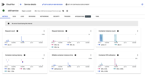
Figure 13-1. Cloud Run dashboard
Creating a Custom Dashboard You can also assemble your custom dashboards from these metrics, such as the amount of memory a specific Cloud Run service is using or the number of Cloud Run instances that are running. You can build dashboards from the Google Cloud console, but to define dashboards programmatically, you can use YAML.
However, you will want something more substantial. The file templates/service-dashboard.yaml.template contains widgets for monitoring a Cloud Run service. Rather than just showing rudimentary metrics, it displays widgets that capture the essence of the golden signals. Let’s take a look at the widgets and their significance.
The dashboard is made up of four widgets that map to the golden signals:
Container instance count
At its core, this widget provides insights into the number of service instances that are currently active. Monitoring this count is crucial because it indicates the service’s saturation level. If the number of instances suddenly spikes, it might suggest a surge in demand or potential inefficiencies that warrant attention.
Request latencies
This widget delves deep into the latency of service requests. By showing P50, P90, and P99 latencies, it offers a granular view of the service’s responsiveness. Tracking these percentiles helps ensure that the vast majority of users experience optimal performance, and it also shines a light on outliers that might require further investigation.
Request Count
Keeping a tab on the traffic is fundamental. This widget counts the number of incoming requests, allowing teams to understand usage patterns, anticipate scaling needs, and even gauge the success of feature launches.
Percentage unsuccessful
Not all requests will be successful, and this widget is dedicated to shedding light on the error rate. It’s paramount to understand why requests fail, as these errors can diminish user trust, affect revenue, and even signal deeper technical issues.
The dashboard also contains the logs from the service. This is useful for debugging and troubleshooting. The idea is that you have a single view of everything important about the service.